ARTICLE AD

When I was a student in the UK, I remember that renting appliances like washing machines and televisions was the norm for some people, especially students living in short-term accommodation. Israeli startup Xyte (pronounced “excite”) has just raised $30 million, as it sees a return to this sort of hardware-as-a-service model to be the way forward for manufacturers whose margins are under constant pressure. If it works so well for software-as-a-service, why not hardware?
Xyte let me take a look at its 27-slide deck to see how it pulled it off. Was I excited by Xyte’s deck? Sadly, no. This 27-slide deck was short on the information that I would need as an investor to make an informed decision on whether or not to invest in it. Let’s break down what I saw.
We’re looking for more unique pitch decks to tear down, so if you want to submit your own, here’s how you can do that.
Slides in this deck
Xyte’s deck features 27 slides, some with redacted information. The redactions relate to its customers and trading figures, which is both fair enough and also makes it a bit trickier to get a picture of the full company.
Cover slide Company overview, including some team details Team slide Opportunity slide Opportunity 2 slide Market slide Problem slide Value proposition slide Solution slide Solution 2 slide Solution 3 slide Dedicated interfaces slide Traction slide ‘Any industry, any size’ slide (Customer base) Value proposition slide ‘Business transformation’ slide ‘Unique business and commerce platform’ slide Customer study slide Pioneering a new product category slide ‘A single integrated platform’ slide Team 2 slide Interstitial slide Business model slide Go-to-market slide Forecast and drivers slide Investment summary slide Closing slideThree Two things to love
You might think that with 27 slides, there would be plenty to pick from for the “three good things” section. Dear reader, I’m not gonna lie: Try as I might, I really struggled to find three good things about this deck.
So, let’s talk about the two sparks of brilliance I could spot in this inky void of despair:
Opening summary

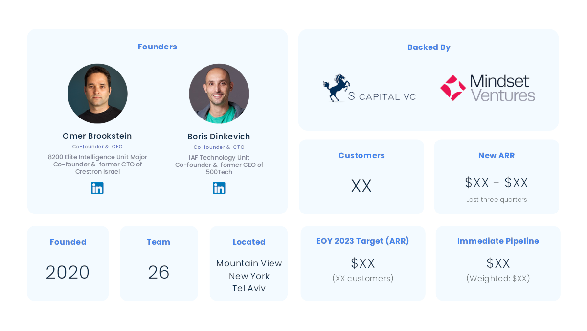
[Slide 2] A very well done at-a-glance slide. Image Credits: Xyte
Xyte’s slide deck, overall, was a pretty underwhelming cavalcade of mediocrity. Still, I did really enjoy this one-slide summary right at the beginning.
Even with some of the core numbers redacted, it shows off a lot of important information at a glance that will likely get an investor to take note. In fact, I think this slide will become my recommended template for most startups raising money — it’s crisp, clear, to-the-point, and it helps set the scene for what’s to come.
Pulling it all together
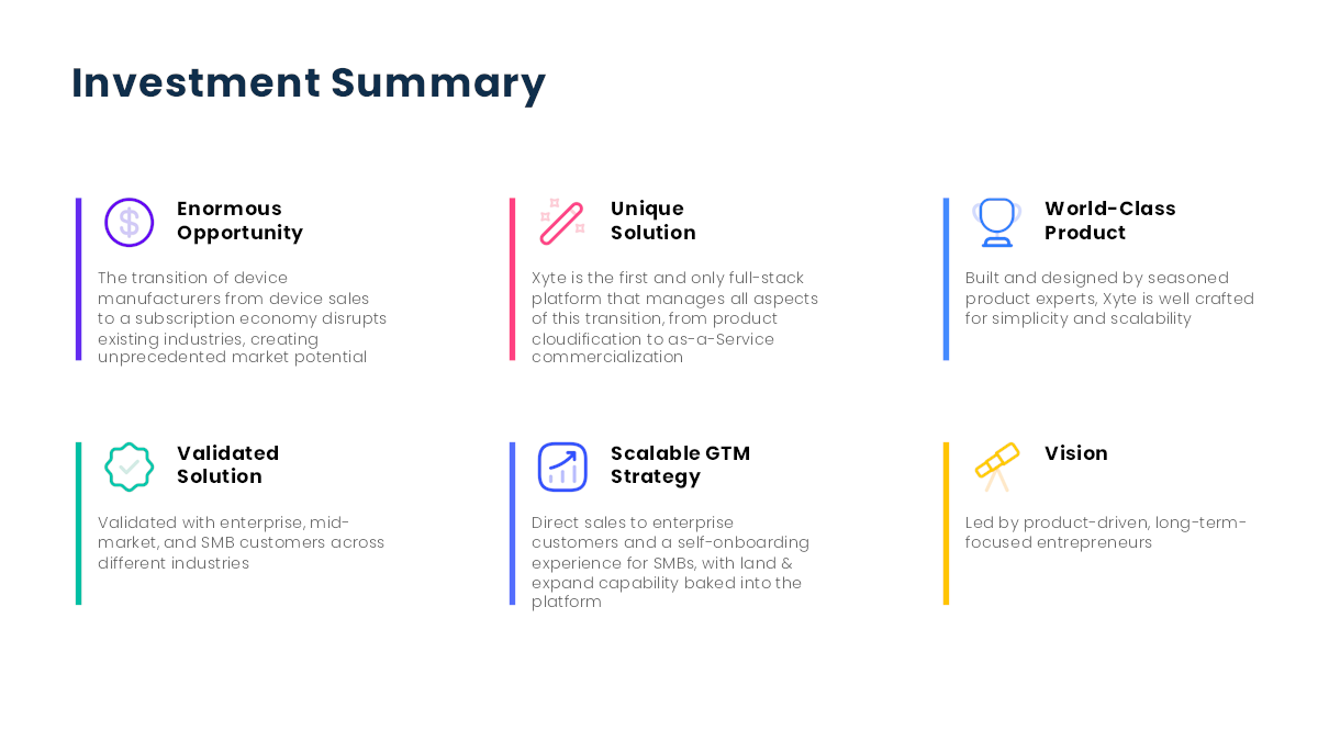
I have a lot of respect for summaries, and this deck pulled it off not once, but twice. The first one sets the stage, and the second one (below) summarizes the same story once more, but through the lens of an investor.

[Slide 26] A solid summary pulling it all together. Image Credits: Xyte
I really like the way the team did this. Illustrating that the company has figured out a problem and go-to-market strategy that makes sense is great. So good, in fact, that I’m going to look at each of these points separately:
Enormous opportunity: Yes! A startup has to reach “VC scale” in order to be investable at all. It might have been worth it to remind the investor of the actual market size here, but this slightly more abstract summary works well. Unique solution: Yes! Including a reminder of what you actually do is great. World-class product: I’d have loved to see this point backed by data, to be honest. Is it a world-class product? Maybe, but bring the receipts! Validated solution: Sure, but remember to include the why. What validates this solution? I suspect the point the company is truly trying to make here is related to the next point… Scalable GTM: Being able to acquire customers at scale is what causes a startup to stop being a startup, and that’s a good thing. For bonus points, I’d have reminded the investors of the CAC:LTV ratio here, but it’s a damn fine start. Vision: Meh. This isn’t a reminder of the company’s vision, which is a missed opportunity. Perhaps, instead, it could have swapped in a team summary to remind the investors why this is the right team to build this company.Minor tweaks aside, I think this slide does a lot of work, and I’m glad the team chose to include it.
In the rest of this teardown, we’ll take a look at three things Xyte could have improved or done differently, along with its full pitch deck!

 9 months ago
55

