ARTICLE AD
Mechanical keyboards are everywhere these days, and there’s a larger variety now than than ever before. If you’re looking to pick one up but want to look beyond the most common layouts and types, read on. Here are 8 mechanical keyboards that stick out from the pack.
Feker Alice 80
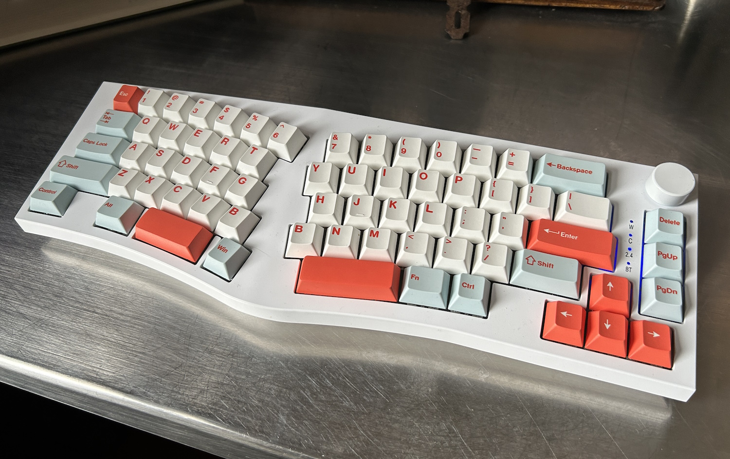
Image Credits: Devin Coldewey / TechCrunch
My first Alice board! And to my great joy, the Feker Alice 80 is a solid — very solid — example of this layout, though its foibles should not be overlooked. The Alice 80 is of a similar build type to Keychron’s Q series, with a full-contact bottom (plus traditional flip-out feet) and all keys mounted on a gasket. In addition, Feker added “a sound dampening silicon switch pad, a silicone PCB foam and a bottom cotton foam” to further silence the Gateron Yellow switches.
I can tell you it makes quite a difference, and anyone would agree in a few keystrokes. The quiet, medium actuation linear switches feel like they’re being pushed through a cloud, and are as close to silent as any mechanical keyboard I’ve used. That is to say, very quiet but for a sort of soft, rippling sound when you’re really going. It’s really very comfortable and my daily driver for now.
This board has a slightly unusual layout, with a windows key to the right of the left space bar segment. I thought I’d hit it by accident a lot, but I didn’t once. It also has a light curve to the angled keys rather than a sudden turn, and a subtle but comfortable tenting angle. On the right edge, you’ve got arrows and page up and down, plus delete. Add a volume dial and that’s it! It’s not as minimal as some, but it’s pretty minimal. If I could have, I would have gotten the 75% version with the function row and aluminum build, but there are none left — for good reason, no doubt. This version is a little flexy and not perfectly balanced, though only at the corners.
But what may put some people off it is the relative lack of customization. The board doesn’t come with any extra keys for swapping out (if you have a Mac layout, say) and although there is a software configurator, I was unable to get it to do more than swap one key with another or macro. So I couldn’t, for instance, set “Play/Pause” to function+down.
I’ll tell you this – if I was sitting down to do a marathon writing session, this is one of the first boards I’d reach for. But if I needed regular access to function and other keys or any kind of more complicated layering (as many keyboard enthusiasts like), then I wouldn’t be able to use it. The feel isn’t quite right for gaming either, in my opinion, but I didn’t let that stop me. That it works wired, on Bluetooth, or using a wi-fi dongle is just icing on the cake.
Feker Alice 98
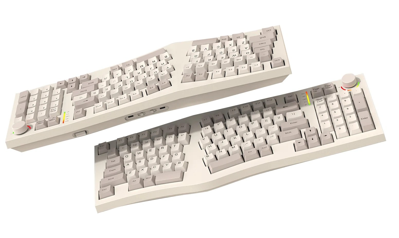
Image Credits: Feker
Here’s a keyboard with a lot of potential but that ultimately didn’t charm me. The Alice layout plus a number pad on the right, a knob, and a tiny LCD screen. Seems like a great match for anyone who wants the ergo benefits of Alice but needs those numbers and doesn’t mind losing a little desktop space.
But the Alice 98 is offered with only Kailh Winter switches, which despite the gasket underneath are just not my style — maybe they just need oiling, but they felt like they had a lot more friction, and not just an intentionally higher resistance. They’re not bad by any means, but the Yellows on the 80 just are a perfect match.
The layout also has a less pronounced tent, almost none at all in fact, which with the tilted key layout actually makes it seem like you’re twisting your wrists inward a bit. I didn’t expect that, but now I understand why the tenting built into the 80 makes it seem flat when it isn’t.
And lastly, the software support just isn’t there for a keyboard of this complexity. The firmware offered on the site didn’t even register as a real file on my computer, and set off some virus-esque alarm bells. And if I’m going to have an LCD on at all times, I’d like to be able to program it properly. So until the 98 gets the support it needs (and maybe some different switches), I can’t really recommend it.
Keychron Q11
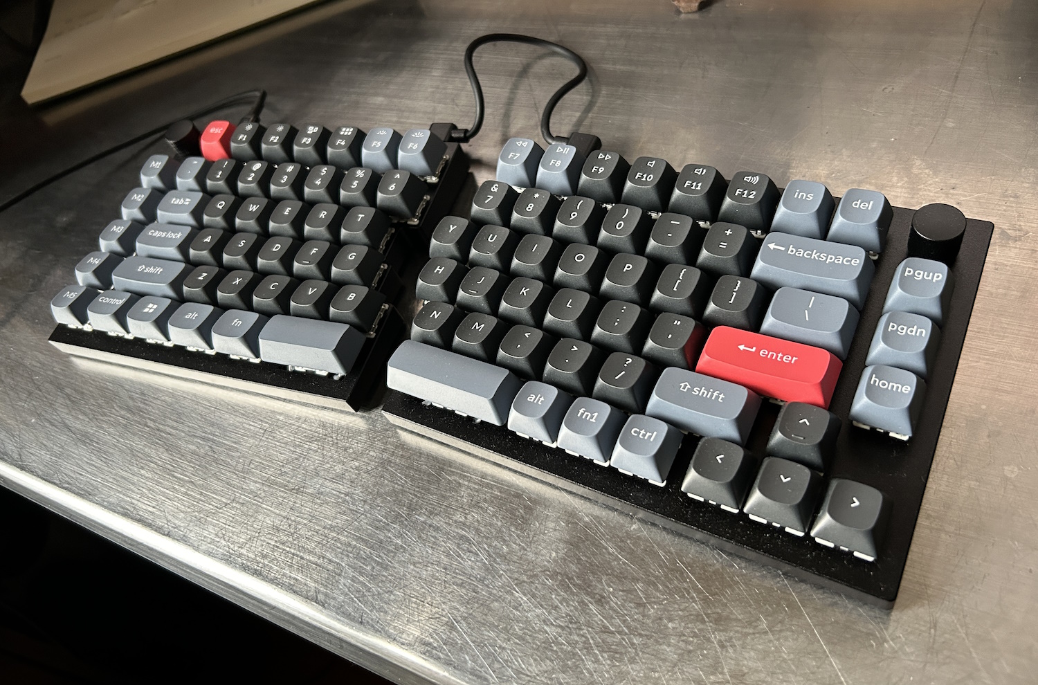
Image Credits: Devin Coldewey / TechCrunch
Keychron has become one of the most popular mechanical keyboard vendors, putting out solid boards with lots of customization options in an increasingly wide range of layouts. This 75% split Q11 is among the latest, and could be a fantastic option for those who don’t need tilting or tenting.
The Q11 is minimal and pleasingly industrial-looking, with a totally flat, very solid build. It sits directly on your desk with small rubberized feet, making it low profile and pretty much as compact as is physically possible with a 75% layout. The halves also fit together cleanly to form a more standard layout. It’s a wired-only board, and you’ll have to connect the two halves with a bridge cable, so if that kind of desk clutter offends you, move on. But for those who don’t mind a little visible cabling, though, it’s a handsome and understated look.
The version I tested has Gateron Brown switches, which make for a nice light typing feel, albeit somewhat harder on the fingers due to the lack of a gasket or dampening layer. After typing on the Feker Alice this was definitely a more raw feel, but it’s still comfortable and quiet — just be wary of bottoming out (and consider selecting a higher resistance switch).
The layout is compact and has plenty of layers plus five dedicated macro keys to the left, and interestingly two knobs, one in each upper corner. Normally the knob is relegated to volume duty and perhaps something else on another layer, but this lets you try out some interesting new use cases, like scrolling the page or moving the cursor. This is a nice, very portable split option if you’re willing to give up a little of that typefeel.
Keychron Q13 Pro
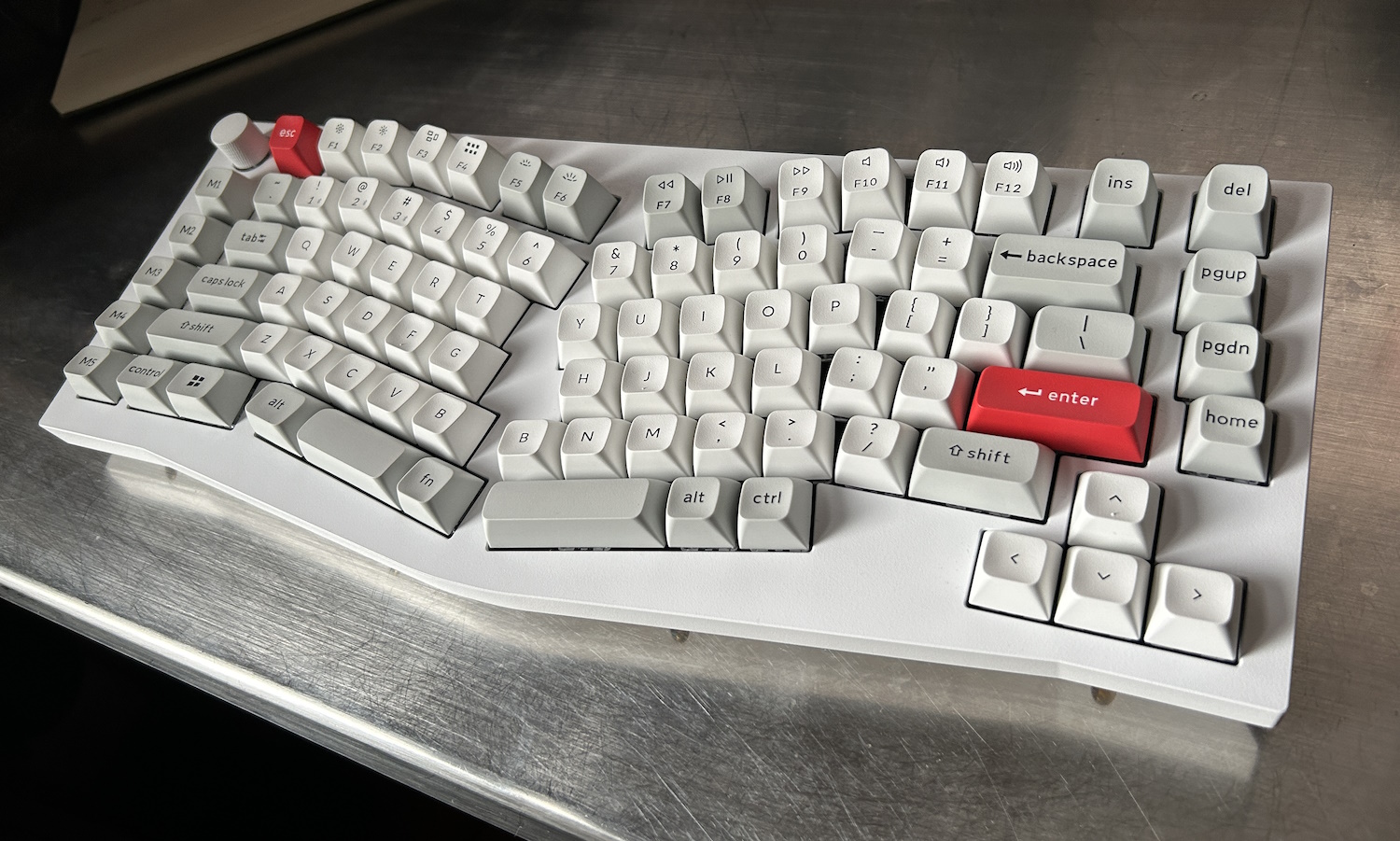
Image Credits: Devin Coldewey / TechCrunch
Well, there’s no getting around it: this keyboard is a bludgeoning weapon disguised as a computer peripheral. Weighing in at 2.4 kilograms (5.2 pounds) and with a solid aluminum body, this is definitely the keyboard I’d reach for if I was being charged by a zombie. You could hammer nails with this thing, no joke. But how does it perform?
With a 75% Alice layout, the Q13 is unusually but practically laid out. The main cluster is traditional Alice (down to two “B” keys), with macro and function keys scattered around the edge in staggered rows. It’s not actually that large, but combined with the weight and increased height it feels more spread out, bulky even.
They keycaps have an extra scoop to them in the Keychron style, which is a mixed bag. In the center and upper rows it feels like they are reaching out to greet your extended finger, minimizing movement. But in the lower rows it feels like there’s a ridge sticking up above where it shouldn’t be. The space bar’s shape, for instance, gives it a sharp angle where my thumb makes contact, which is not something I enjoyed, and somehow the act of reaching for the backspace key puts the middle of my right hand in contact with the up-thrusting left arrow key.

Too much scoop.
These aren’t dealbreakers (well, the space bar was for me) but they might require a bit of getting used to, or a bit of key swapping.
It connects via Bluetooth or cable, and can sync with 3 different devices at once and switch quickly between them — always useful.
Cloud Nine ErgoTKL
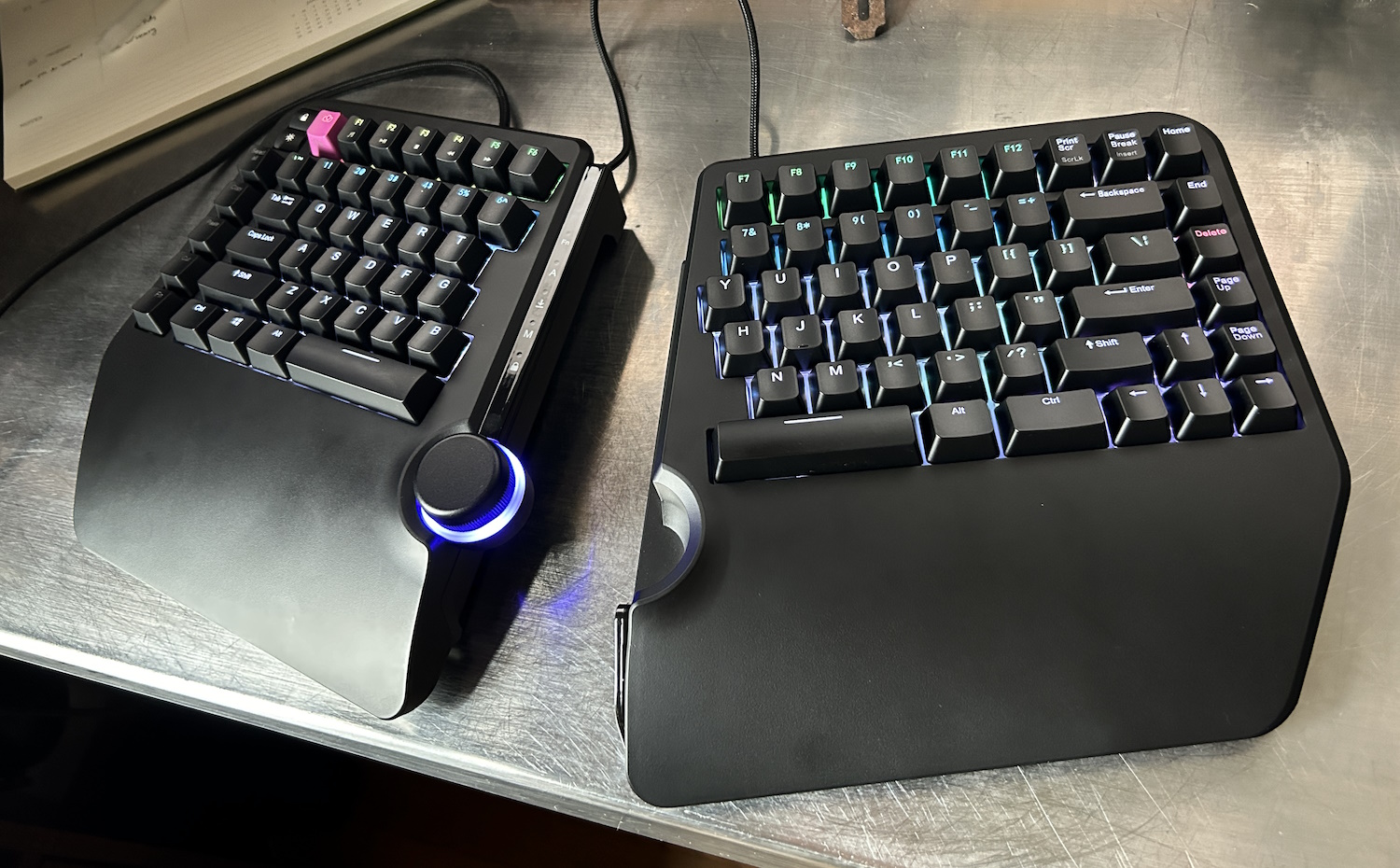
Image Credits: Devin Coldewey / TechCrunch
A full-featured split ergo keyboard, the Cloud Nine ErgoTKL packs a lot of options into a relatively compact package. It has a compact tenkeyless layout but with a full (if unseparated) function row, which I appreciate, as well as arrows and navigation, plus a couple swappable macro keys on the left. And of course there’s that great big wheel in the middle.
The ErgoTKL has the split angle to its key layout, plus a light built-in tenting angle that I found quite comfortable, though being able to adjust it would have been a plus. The two halves are easily separated but also come together nicely with a magnet to form a whole, with the wheel dead center.
The switches, Kailh Browns on my unit, were light and snappy, with an audible but not bothersome click — you can pick linear Reds or clicky Whites as well. I could ask for a bigger space key — it seems like not all the ergo keyboard makers account for the different position your thumb takes when at this angle. Or maybe it’s just me, but I end up on the corner of the space key when it’s canted this way.
It is of course full RGB, something I’ve never had any use for, and almost all the pre-loaded modes are gaudy, shifting rainbows. Fortunately there’s a very easy to use configurator that I put together a nice, chill custom color layout in within minutes.
The central wheel is a nice tactile one, which you can set to a variety of functions (though sadly not cursor movement). It kind of looks like it would get in the way, but that never once happened for me. I only wish I could assign it to have one function normally, and another while activating the Fn layer.
I had some slight issues with mine, one with a random repeating disconnection that seems to have fixed itself, and another in that the left half of the keyboard doesn’t sit flat on its little rubber pads. With the weight of my hand on it, it’s plenty stable, but it’s troubling in a serious keyboard to see it wobbling back and forth. The plastic palm rests are also not great, I’d spring for the padded ones.
8bitdo Retro Mechanical Keyboard
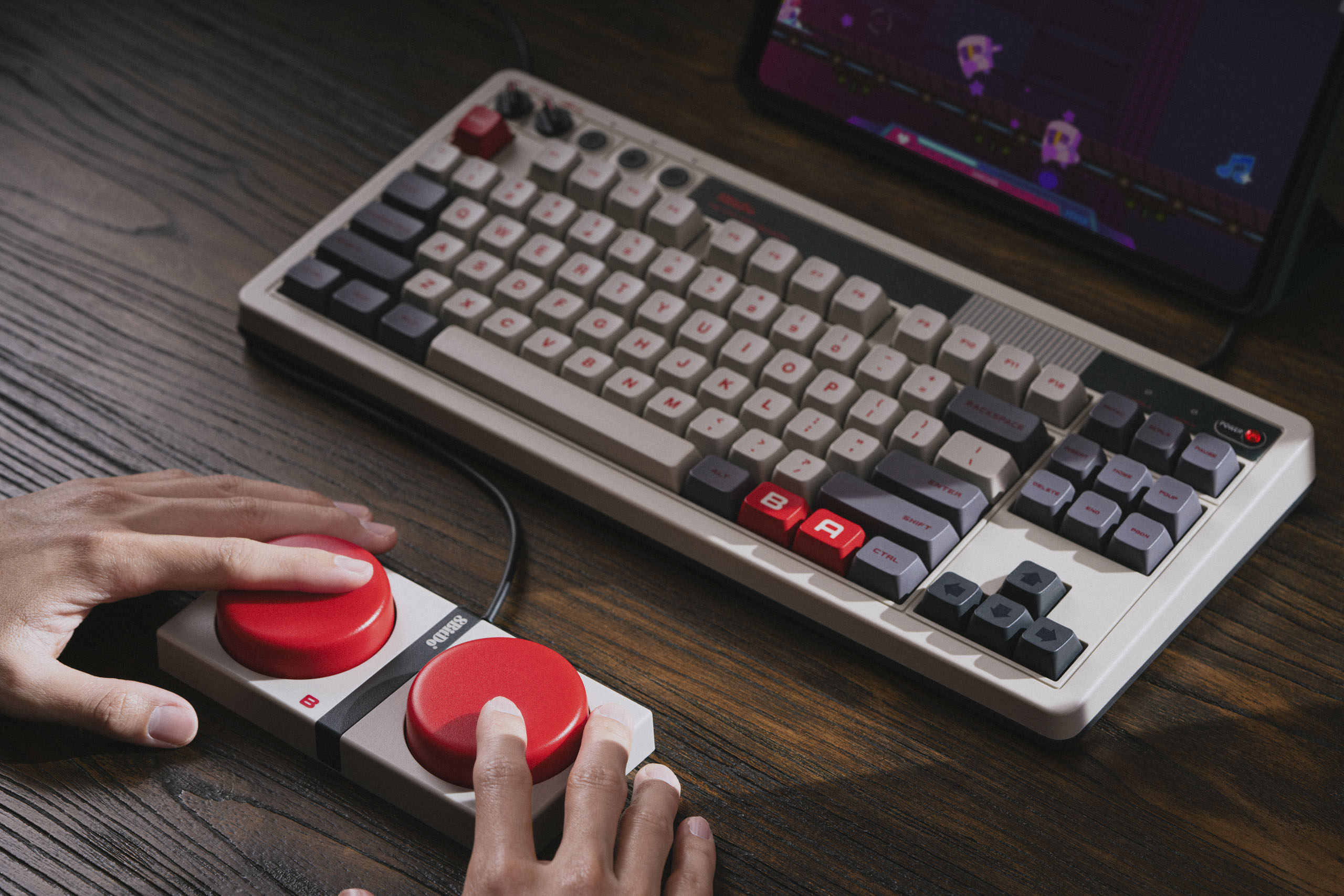
8BitDo’s NES-themed mechanical keyboard.
Okay, this one isn’t really ergonomic, but it is unusual. This wired/wireless (dongle or Bluetooth) mechanical is fully custom from the switches up, and obviously it falls under 8BitDo’s retro aesthetic to the point where you might think it’s an official Nintendo accessory. (It’s not.)
It’s a very clicky keyboard, but comfortable as flat layouts go, and compact enough that you can easily add your own wrist rests. There are two built in dials, one for wireless mode select and one for volume. But the real innovation is the giant macro buttons marked A and B like huge NES controllers.
Look, I’m aware there are other standalone macro clusters out there. You can buy one for 10 or 20 bucks online. But these huge, cherry red mega-buttons are something else. I’ll say right now that they’re not quite as satisfying to press as they look, but they feel durable enough that you can really whack them if you’ve assigned them to stuff like close application or end call.
HHKB Studio
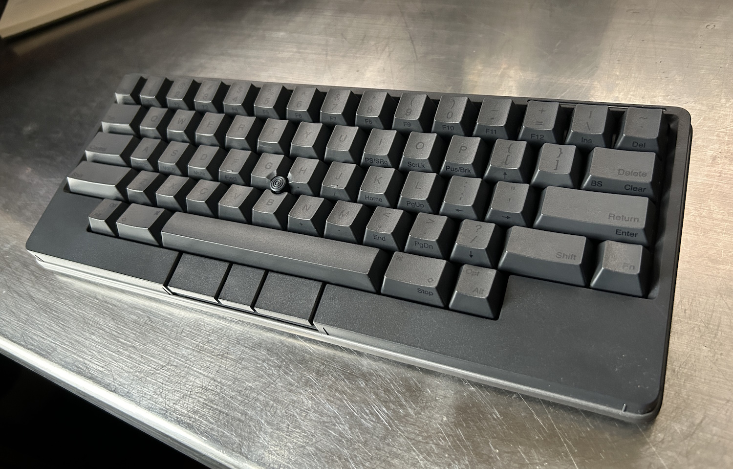
Image Credits: Devin Coldewey / TechCrunch
Here’s an odd one and no mistake. The HHKB Studio is one of a kind, with a unique layout, a pointer nub, mouse buttons built in, and four — count ’em — four touch-sensitive strips all around it. The idea behind it is to remove the necessity of a mouse at all, letting you never move your hands from the keyboard.
And although it would take some getting used to, I think the hardware (handsome, understated, and well-built) truly supports this proposition. But there are a handful of major quirks you’ll have to get past.
First, and most unhinged, is that there is NO BACKSPACE KEY. At least by default. You need to adjust a dipswitch to change delete to backspace, or you can do it in the customization software. Then, as you may know if you’re familiar with the Happy Hacking layout, caps lock is replaced by control, and delete/backspace and the forward slash have switched places. Though these changes are made with good intent, I simply can’t abide some of them, though fortunately it was easily configured. Lastly, the choice to use AA batteries instead of a rechargeable one is just plain strange to me!
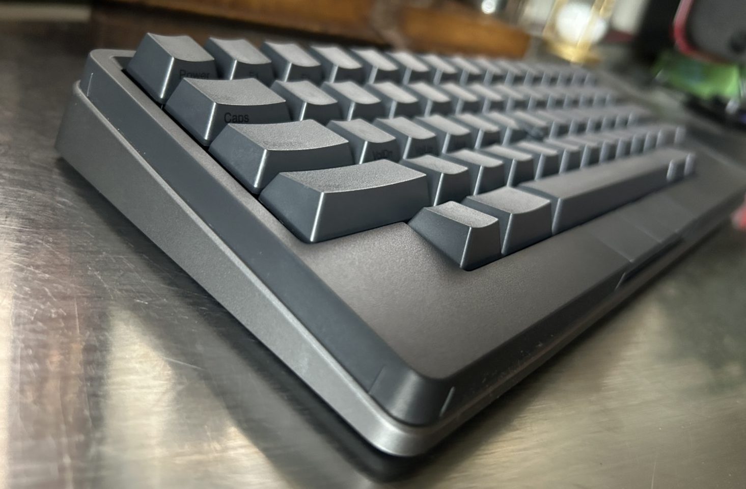
The space between the little upraised bits is touch-sensitive. Image Credits: Devin Coldewey / TechCrunch
The trackpoint is good, and adequate for desktop tasks, and the presence of mouse buttons just under the space bar is quite nice once you get used to it. It’s a bit odd hitting left click with my left hand while moving the cursor with my right, but it does save me a trip to the mouse.
The capacitive strips are the most interesting piece, though, and I think they’re a qualified success. They run along the edges of the board, two on the front and one on each side. The left ones are set to basically repeat arrow keys (nice because they’re not present on this very compact layout), and the right ones are scroll up/down and switch apps by default.
This could be a real time saver, but you need to get good at it, because there’s no tactile feedback and the strips themselves can be a little hard to find sometimes. And then, when they’re activated, they can be a little unpredictable. While I appreciate the effort that went into packing this much capability into this much space — and it really is a lot of power in a remarkably small form factor — I feel like the purpose would be better served with the strips facing upwards, or maybe even being along the corner (if that’s possible).
If you’re a really keyboard-centric person and want to be even more so, or want a good couch keyboard option, the HHKB Studio could be a real eye-opener.
Kinesis Advantage 360 (Quiet Limited)
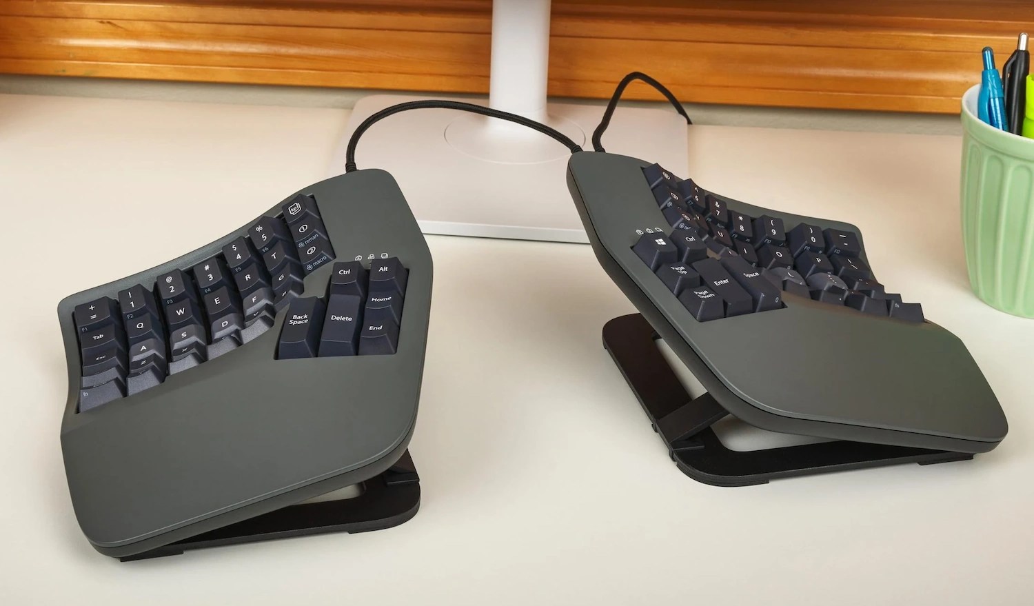
Image Credits: Kinesis
If you’re ready for an ergo adventure, here’s one that’s challenging yet logical. The Advantage360 is Kinesis’s high end model with not just a columnar layout but a concave contour to minimize finger movements. And then your position and modifier keys are all in thumb clusters. The one I tested was a limited edition with Kailh Box Pink Linear Quiet switches and special colorway.
Look, any one of these things I could probably adapt quickly to. Two would take time. All three at once is madness! That said, it’s really obvious that this could be an extremely comfortable and worthwhile layout for someone willing to put in the time, like the Moonlander I tried in the last roundup. Or if you’re already in this wild world of layouts — this is a nice one.
The Advantage360 also has a sturdy tenting paddle setup that let me get a pretty sharp angle going. Overall the build quality was outstanding.
On the days I was using it, I would alternate between being unable to locate C and suddenly and effortlessly typing a word with what felt like no movement at all. This is definitely a specialist keyboard, and the price ($449) reflects that, but if you’re already rocking a columnar or concave layout you may adapt to this one in a jiffy. Well, maybe not a jiffy.

 10 months ago
34

