 4 months ago
40
4 months ago
40 ARTICLE AD
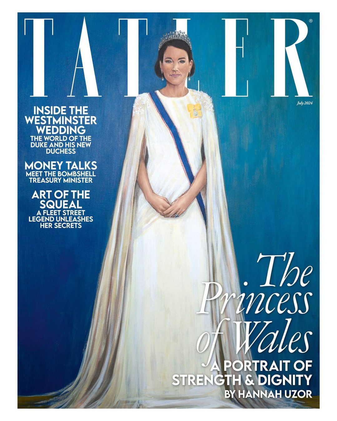
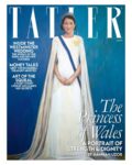
Real talk: the more I look at and evaluate Jonathan Yeo’s “blood-soaked” portrait of King Charles, the more I love it. I’m not pretending to be a professional art critic or anything, but I love the sub-genre of “discussions about artwork done with royals-as-subjects.” Yeo’s portrait of Charles is thought-provoking, evocative and it’s just a really interesting painting overall. The fact that Yeo actually captured Charles is the icing on the cake. Compare Yeo’s portrait to Hannah Uzor’s Tatler-commissioned portrait of the Princess of Wales, and Uzor’s is found wanting. It’s not striking, it doesn’t look like Kate, and the whole piece is so flat and lifeless.
Outrage and opinions followed the unveiling of Yeo’s portrait of the king. Charles’s name was trending on social media for days as everyone dissected the painting. Mainstream, international outlets got in on it too, everyone wanted to talk about Yeo’s portrait. It feels like Tatler is trying to force the same thing about Uzor’s portrait of Kate, only everyone just flatly hates it. The Telegraph’s art critic Alastair Sooke called Uzor’s piece “intolerably bad.” Some of his review:
Sorry, who is she meant to be? The Princess of Wales? You could have fooled me. Even by the standards of modern royal portraiture (and there have been many abominable likenesses of senior members of our royal family produced over the past century), Tatler’s new cover image – an “exclusive” portrait of the Princess of Wales by the British-Zambian artist Hannah Uzor – is egregiously, intolerably, jaw-hits-the-floor bad.
I’ve spent the past hour or so – time, incidentally, that I will never get back – scrutinising Uzor’s “likeness”, and, still, I cannot divine any flicker of resemblance between it and the woman it’s supposed to depict. At first, my editor thought it was meant to represent Meghan, Duchess of Sussex; its subject’s smirk made me think, initially, of Anne Robinson fronting The Weakest Link.
Has there been a flatter, more lifeless royal portrait in living memory? (It’s no surprise to learn that Uzor based her picture on video footage of, rather than personal sittings with, her subject.) Beneath a Lego-like helmet of unmodulated, monotonously brown “hair”, this Princess of Wales has as much charisma as a naff figurine atop a wedding cake.
She holds herself with the bored bearing of an air stewardess about to begin an in-flight safety demonstration – which is additionally awkward, given that this was a job once performed by Catherine’s mother (a fact that, in years gone by, reportedly attracted the ridicule of William’s snobbish friends).
Even her outfit (which she wore to the King’s first state banquet) appears stiff, with that rigid blue sash restricting her like a seatbelt. Her tiara doesn’t sparkle and those diamond-drop earrings fail to shine; towards the image’s bottom edge, her gown seems to disintegrate into streaks of brittle wax, like something desiccated and shrivelled worn by Miss Havisham.
The Miss Havisham reference is WILD, as is the air stewardess reference, OH MY GOD. Sooke really hates the bejesus out of this piece. Someone else who hated it? “Royal commentator” Michael Cole:
Discussing the portrait of The Princess of Wales which appeared on the latest edition of Tatler, Mr Cole told GBNews: “It’s dreadful, isn’t it? It’s as dreadful as Jonathan Yeo’s red portrait of the Red King was brilliant and wonderful.
“It is really a daub, a most dreadful daub. But what Tatler’s doing sticking it on the cover? I have no idea at all. I think she’s got the garter sash right. Everything else is wrong. Certainly the features, certainly the deportment: everything about it. I have no idea why on earth that would be put on the cover of such a long-established, well, it’s the Toff’s bible, isn’t it? Tatler. I don’t know what they’ll think of it at all, and I don’t think it’s helpful either, because at this moment, as we know, Kate, The Princess of Wales, is undergoing treatment for an unspecified cancer.
“To have a picture of her, which might have been done by that man who did The Scream, [Edvard] Munch. Mr Munch might have done this if he’d thought of doing a portrait of the Princess of Wales. Now I think it’s best forgotten. I think it’s one of those magazines you just want to turn it over and see the advert on the back page.”
Some of you suggested something similar, which is that Tatler was being purposefully shady by commissioning this portrait and putting it on the cover. While that’s absolutely a possibility, am I the only one finding this hate for the piece a bit… dramatic and performative? While Uzor’s piece looks nothing like Kate, it’s also not unflattering, per se. It’s not like Uzor depicted Kate as slovenly or squatting down to take a dump. Uzor captured Kate’s authentic “flatness,” her dull two-dimensionality. Maybe that’s why the royalists hate it.
General election? There’s only one debate in Britain right now: where do you stand on the new portrait of the Princess of Wales for the cover of Tatler?
Get the inside scoop in Tatler’s July 2024 issue, on sale 30 May. https://t.co/KZ0QuX1gRS pic.twitter.com/LQVZU0FNj2
— Tatler (@Tatlermagazine) May 23, 2024
Photos courtesy of Cover Images & Avalon Red. Cover courtesy of Tatler, portrait courtesy of Jonathan Yeo.
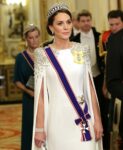 LONDON, ENGLAND – NOVEMBER 22: Catherine, Princess of Wales during the State Banquet at Buckingham Palace on November 22, 2022 in London, England. This is the first state visit hosted by the UK with King Charles III as monarch, and the first state visit here by a South African leader since 2010.,Image: 739545133, License: Rights-managed, Restrictions: NO UK USE FOR 48 HOURS- Fee Payable Upon reproduction – For queries contact Avalon sales@Avalon.red London +44 20 7421 6000 Los Angeles +1 310 822 0419 Berlin +49 30 76 212 251 Madrid +34 91 533 42 89, Model Release: no, Credit line: Avalon.red / Avalon

 Artist Jonathan Yeo, at the unveiling of artist Jonathan Yeo’s portrait of the King, in the blue drawing room at Buckingham Palace, London. The portrait was commissioned in 2020 to celebrate the then Prince of Wales’s 50 years as a member of The Drapers’ Company in 2022. The artwork depicts the King wearing the uniform of the Welsh Guards, of which he was made Regimental Colonel in 1975. The canvas size – approximately 8.5 by 6.5 feet when framed – was carefully considered to fit within the architecture of Drapers’ Hall and the context of the paintings it will eventually hang alongside
Featuring: Jonathan Yeo
Where: London, United Kingdom
When: 14 May 2024
Credit: PA Images/INSTARimages
**NORTH AMERICA RIGHTS ONLY**
Artist Jonathan Yeo, at the unveiling of artist Jonathan Yeo’s portrait of the King, in the blue drawing room at Buckingham Palace, London. The portrait was commissioned in 2020 to celebrate the then Prince of Wales’s 50 years as a member of The Drapers’ Company in 2022. The artwork depicts the King wearing the uniform of the Welsh Guards, of which he was made Regimental Colonel in 1975. The canvas size – approximately 8.5 by 6.5 feet when framed – was carefully considered to fit within the architecture of Drapers’ Hall and the context of the paintings it will eventually hang alongside
Featuring: Jonathan Yeo
Where: London, United Kingdom
When: 14 May 2024
Credit: PA Images/INSTARimages
**NORTH AMERICA RIGHTS ONLY**
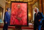 Artist Jonathan Yeo and King Charles III at the unveiling of Yeo’s portrait of the King, in the blue drawing room at Buckingham Palace, London. The portrait was commissioned in 2020 to celebrate the then Prince of Wales’s 50 years as a member of The Drapers’ Company in 2022. The artwork depicts the King wearing the uniform of the Welsh Guards, of which he was made Regimental Colonel in 1975. The canvas size – approximately 8.5 by 6.5 feet when framed – was carefully considered to fit within the architecture of Drapers’ Hall and the context of the paintings it will eventually hang alongside
Featuring: Jonathan Yeo, King Charles III
Where: London, United Kingdom
When: 14 May 2024
Credit: PA Images/INSTARimages
**NORTH AMERICA RIGHTS ONLY**
Artist Jonathan Yeo and King Charles III at the unveiling of Yeo’s portrait of the King, in the blue drawing room at Buckingham Palace, London. The portrait was commissioned in 2020 to celebrate the then Prince of Wales’s 50 years as a member of The Drapers’ Company in 2022. The artwork depicts the King wearing the uniform of the Welsh Guards, of which he was made Regimental Colonel in 1975. The canvas size – approximately 8.5 by 6.5 feet when framed – was carefully considered to fit within the architecture of Drapers’ Hall and the context of the paintings it will eventually hang alongside
Featuring: Jonathan Yeo, King Charles III
Where: London, United Kingdom
When: 14 May 2024
Credit: PA Images/INSTARimages
**NORTH AMERICA RIGHTS ONLY**